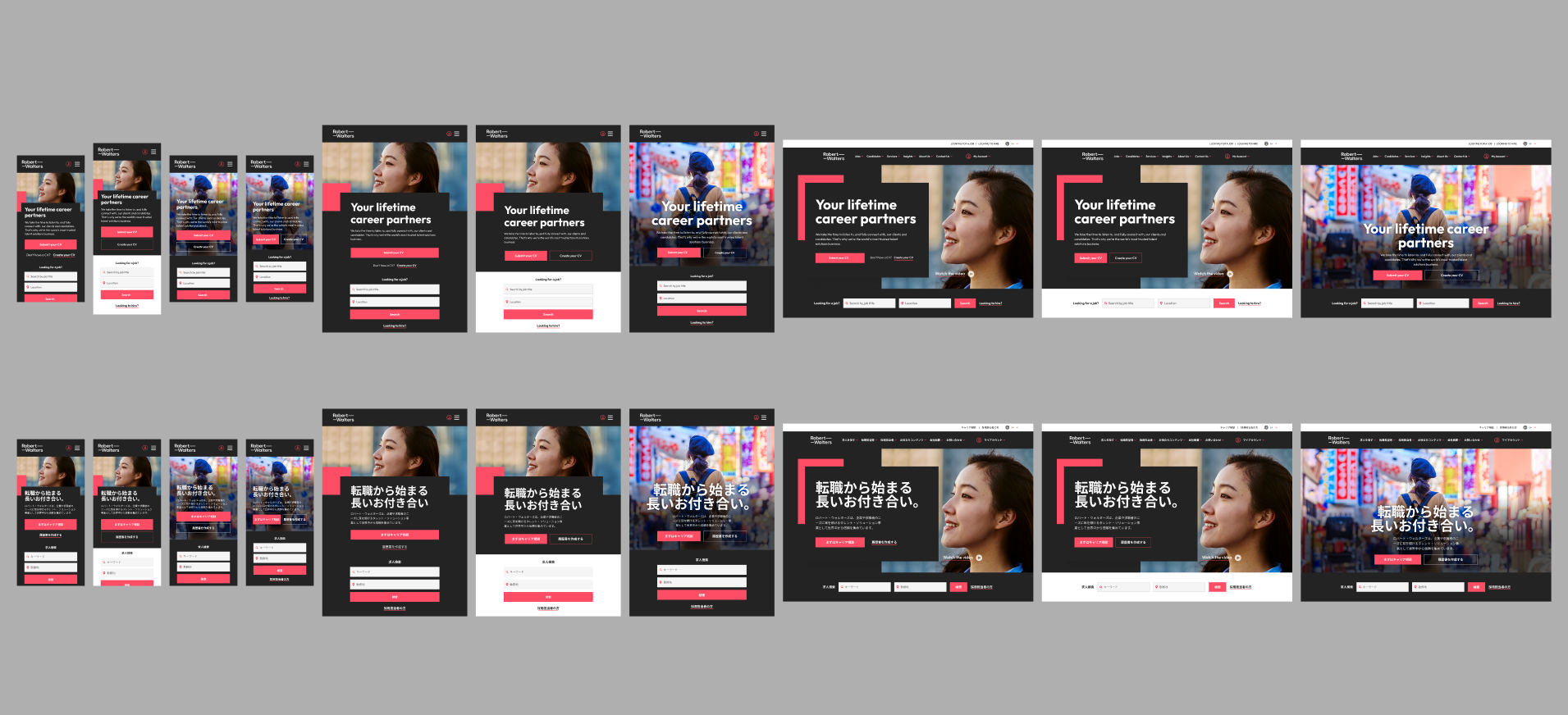
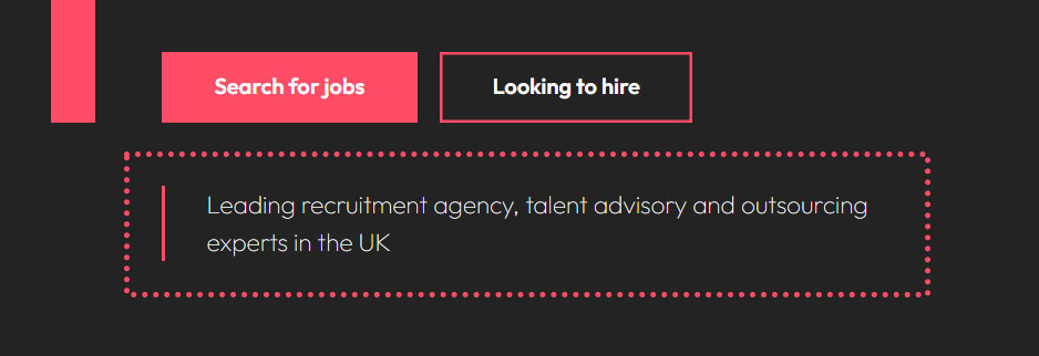
The Japan office required a redesign of its homepage banner to better support user engagement by presenting two clear action paths. The previous design allowed local marketers to include a title, a paragraph, and an optional single call-to-action button.
However, with over 2,000 job openings currently advertised on the Japan region’s website, and a high volume of potential candidates visiting the platform, it became essential to optimize the homepage for maximum impact and usability.
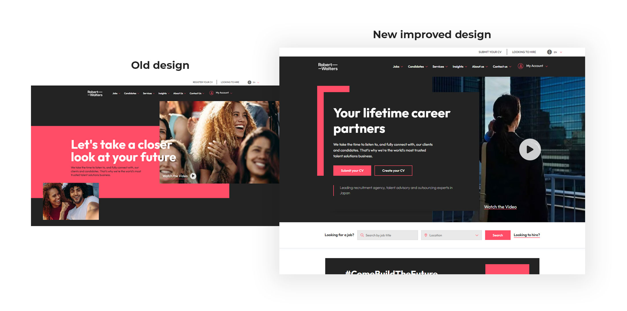
The original design was developed following the company’s rebranding initiative. Upon launch, it was well received and made a notable impact within the industry. The homepage banner was intentionally designed with a broad, global appeal to ensure it was suitable for multiple regions.
As the business evolved, it became increasingly clear that certain regions require more tailored solutions.
In Japan, for instance, the market is highly candidate-focused. With over 2,000 job openings currently advertised, the homepage must prioritize the candidate experience. It is essential to guide potential applicants through a journey that not only supports their success but also contributes to the overall success of the business.
Some questions asked to understand the needs and wants of both users and the business. Some data cannot be shared on here as it is seenn as confidential.
The new design has been very well received by the business and, as a result, has been rolled out across all other countries. It has also been further optimized with a new H1 title to support SEO performance and improve search visibility.
“If you want creative workers, give them enough time to play.” — John Cleese
© 2026 All rights reserved.